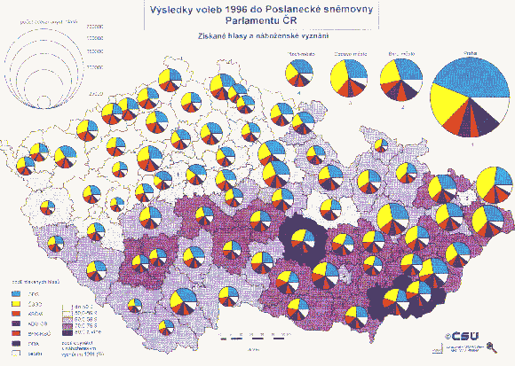
Here we see a proportional circle map similar to the previous, in that the circles represent an increase or decrease in the given variable and it has five classes. It differes in that within the circle proportions of other variables are represented. Though it is unclear what exactly is being represented in this map (due to the language barrier), one could imagine that the circles represent population, and the different colors represent ratial variations within those populations.
No comments:
Post a Comment