Friday, April 23, 2010

Star plot


Star plots represent multiple sets of data and their mathematical relationship to one another. It allows one to easily see a wide range of variables.

Similarity Matrix


A similarity matrix shows the similarity between two different sets of data. Where different colors are assigned to different "similarity" numbers which are relative to the graph. Here the graph ranges from zero to one, the interesection of two lines represents the similarity between those two points.

Histogram


A histogram is essentially a bar chart that shows different tabular frequences. For example this map shows different score categories (split into five categories) and the percent of students that scored in that range

Tuesday, April 20, 2010

Parallel coordinate graph


A parallel coordinate graph is used to graph multiple variables in one chart. Each variable is plotted on its own Y axis and then lines are drawn between them to show densities of correlations.

Triangular Plot


A triangular plot, though somewhat confusing, can be a very useful tool. It plots the relationships between three different variables, the points of which represent their valued intersection between the three different axies. Here we have a soil texture plot plotting the % of three different compounts within a given sample

Windrose


A Windrose is a very interesting circular map that graphs wind direction over a set period of time. It shows the % of the time the wind blew in a given direction over this pre-determined period.

Climograph


A climograph gives the relationship between temperature and precipitation over a given area.

Box plot graph


A box plot graph plots data over a given range and breaks it up into quartiles. Inbetween the second and third quartile is the median. For example here we have test scores

Population Profile


A Population profile shows the relationship of men vs women in a given region, plotted against some other varible. In this case, it is the pop. of men an women with aids in a given region plotted against age. This can be very useful in ascertaining if a certain anomoly affects one sex greater than the other.

Scatter Plot 2


I wished to show that though all scatter plots work as previously mentioned, sometimes no correlation can be found (which is somewhat of a proof in and of itself). If this is the case it is said to have a weak, or no correlation, which would be this example of grip strength plotted agains arm strength

Scatter Plot Graph


A scatter plot graph is the bread and butter of scientists. It graphs different x values against different Y values and attempts to determine a correlation. The graph I have chosen to represent this has odd values for the X and Y axis, but the log base two implies that the variables they are graphing are exponents in some equation. This graph has a very strong correlation with an r^2 value of .992

Index value plot


An index value plot is a graph that is plotted against an absolute number. In this graph the time is graphed against and index value for houses. Though I cannot be sure what this index value is exactly, it is safe to say that it is a derived value that properly represents housing values.

Lorenz Curve


A Lorenze curve graphs the data distribution against an equal distribution line. This is to say that the acutal data line is graphed, then overlayed ontop of it is the line that would represent and equal distribution of the data in question. this is very good in determining disparages from an average.

Bilateral Graph


A Bilateral Graph relates two sets of data in an easy to visualize manner, where the data all has a common zero point. These graphs represent two classes of data, so long that must have a common origin.

Ordinal point Map


Though this map is not the best representation of this map class (it has no key), it still conveys the point (pun not intended). In an ordinal point map, the points do have a qualitative correlation relative to one another, though there is no actual numerical value assigned to the group. For example, one could assume that the purple planes here represent regional airports and the red planes represent international airports.

Nominal point or line Map


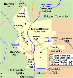
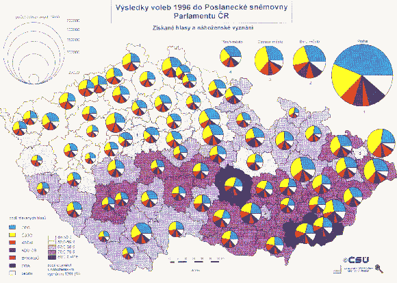
A nominal point map is similar to a nominal area map, only instead of using shaded areas to represent qualitiative differences in areas, it uses different points (normally different shaped points) to represent the difference. Also nominal line maps work similiarly, but with lines. This map actually represents a nominal point, line, and area map.

Nominal Area Chloropleth map


A nominal area chloropleth map represents nominal data by shading different areas different colors. As opposed to the chloropleth maps shown so far, these maps' colors in no way relate to one another in a numerical sense, they only distinguish different qualitiative data. This example is of republican and democratic states in the 2008 presidential election.

Monday, April 19, 2010

Unstandardized Chloropleth Map


As mentioned before an Unstandardized chloropleth map is one that does not take into acount the area over which the variable was taken. I reused the double map from the previous entry to illustrate the difference between a Standardized and Unstandardized map

Unstandardized Chloropleth Map


As mentioned before an Unstandardized chloropleth map is one that does not take into acount the area over which the variable was taken. I reused the double map from the previous entry to illustrate the difference between a Standardized and Unstandardized map

Standardized chlorpleth Map


A standardized chloropleth map averages a given variable over an area. This can be used to represent population densities or variables of the like. It can not be used to represent total population, because this would not be standardized over a given area and thus would be an unstandardized map, which will be discussed next. The bottom map above is a standardized chlorpleth map

Bivariate Chloropleth map


As the name implies, a bivariate chloropleth map represents two different variables superimposed on the same map by using two different types of colors (in this map we see they used the color purple and a density of shading) This can be very useful in determining a correlation between the two variables over a third variable: area.

Continuously variable proportional circle map


Though I have already posted several porportional circle maps, there are several types I forgot to include, Continuously variable being one of them. Here we see the map not represented with a certain number of classes, but like the unclassed chloropleth map, the area of the circle is directly proportional to the variable being discussed. Though it is difficult to tell what is being represented in this map, we see that no key is nessisary to tell us what numerical value each circle represents

DOQQ map


A DOQQ map is produced from a raster image of the area, and removes displacement from elevation and the camera, to produce a two dimensional image. The colors can be removed or changed if nessisary to emphasize certain areas of the map. Here we can clearly see the contrast between the land and the blue river

DEM map


A DEM map (Digital elevation model) map digitally renders the elevation of a given area. This can be very useful in representing the height of a given area and can give someone a much better feel of the topography than a contour line map

DLG Map


A DLG map (Digital Line Graph) uses the vector system to reference points. The map above uses the DLG system to map an area near the chattahoochee river.

DRG Map


A DRG Map (Digital Raster Graphic) is a scanned copy of a map using the raster system of referencing instead of vector (using an x,y co-ordinate plane). This map is a copy of a map from the USGS.

Isopleth Map


An isopleth map uses contour lines to connect areas containing an equal amount of a given variable. The variable is one that must be averaged over a given area (such as population density, or density of married couples). These maps can be used to show a wide range of different datum. This map shows the concentration of hazardous airborne chemicals.

Isohyet Map


An Isohyet map uses contour lines to connect areas of equal precipitation. This can again be used by meteorologists. If plotted against time one could get a feel for the increase or decrease of rain over time to measure changes in global climate

Isotach Map


An isotach map uses contour lines to connect areas of equal wind speed. Isotach maps can give one a good idea of the weather in given areas and can be used by meteorologists to help predict weather

Isopatch Map


An Isopach map uses contour lines to measure the different thicknesses of rock. It is very useful to geologists. This map also has a three dimensional inlay to help understand the layout of the area.

Sunday, April 18, 2010

Isobar Map


An isobaric map uses contour lines to represent changes in pressure. Here we see it represented not only by countour lines, but as a countour map superimposed upon a chloropleth map, representing the same information.

LIDAR


LIDAR uses lasers, normally mounted on an aircraft, to gain a highly accurate image of the ground. Lasers are pulsed towards the ground and their response time is recorded and compaired to the position of the aircraft to form an image of the area being surveyed. Here is an example of a LIDAR map of a city.

Doppler Radar


Doppler radar is used to plot different weather patterns over a given area. It uses active imaging by transmitting microwaves and using the amount of time it takes for them to be bounced back to calculate distance (similar to SONAR, but with light).

Black and White areal Map


A black and white map can be a very useful mapping tool. It allows the reader to more quickly distinguish areas of interest,a nd can highten how much certain areas stand out. Pictures of the same area over periods of time can also be used to detrimen the change in the area.

Infrared Areal map


Infrared is a powerful too where the heat spectrum of light is recorded and dyed a visible color (because we cannot see heat light) so the amount of heat can be seen over a given area. This technique can be used, among other things, to determine the amounts and even types of vegitation in a given area.

Cartogram


A cartogram is a type of thematic map where some other variable, such as population, is subsititued for land area. This can normally form some very odd looking map, but it does afford the reader a very real look at how the variable is represented (sometimes very disproportionately to the land area). Here the area has been substitued for popular votes in a recent presidential election.

Flow map 2


Here is another example of a flow map, but this is a mental flow map. Here we see one event being linked to another in an obvious flow (here it is the directions on how to make a peanut butter sandwich). I felt it was important to represent both the physical flow maps and the mental flow maps in this section

Flow map 1


There are many different types of flow maps. The more conventional one posted here is used to show the direction or amount of travel of a given variable (people, freight, etc.) from one place to another, where the thickness of the line represents the intensity of travel. This map has five classes of intensity, and is nominally varied by two colors (the meaning of the nominal variation is not described in the picture)

Proportional Circle Map 2


Here we see a proportional circle map similar to the previous, in that the circles represent an increase or decrease in the given variable and it has five classes. It differes in that within the circle proportions of other variables are represented. Though it is unclear what exactly is being represented in this map (due to the language barrier), one could imagine that the circles represent population, and the different colors represent ratial variations within those populations.

Proportional Circle Map 1


This is a good example of the average proportional circle map. There is one varible, where the size of the circle is proportional to the amount of the variable. This proportional circle map is split into five classes, though some can be unclassed, where the area of the circle varies directly with an increase ore decrease in the given variable.

Chloropleth map 3


In this final chloropleth map, we see an unclassed chloropleth map. Here the boundaries of each area are again pre-set by national lines, but the colors of the areas (the classes) can vary infinitely. This can be very useful to have this level of precision in your readings, though sometimes it can become cumbersome to the map reader.

Chloropleth Map 2


Here we have another chloropleth map, but it is important to notice the difference between this map and its predicessor. Here we see that the boundaries for each area are not determined by pre-set boundaries such as state lines. The boundaries were probably determined by which areas had the smallest variance of the given variable (in this case crops). The classes however, are still defined by equal steps

Chloropleth map 1


Chlorpleth map is a very wide term that can be used to desribe a lot of different maps. Here we have a chloropleth map in five different classes. This is to say that the map represents five different ranges, each range being represented with a different color. The boundaries of these ranges are the state boundaries, which probably means that they took the average of the variable over the entire state. This can sometimes be misleading, due to the fact that the state may have vast variations of the given variable within its boundaries which would not be represented by this map.

Dot Distribution Map


This dot distribution map was created by the US census to show a distribution of population. Dot maps are good at conveying very quickly one type of information. If you try to add more nominal information, the map tends to get cluttered (i.e. different types of dots). Each dot represents a constant amount of a certain variable.